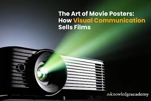
The Art of Movie Posters: How Visual Communication Sells Films
Have you ever been drawn to a film just by looking at its poster? That’s the power of visual communication in action. A well-designed movie poster doesn’t just advertise a film brilliantly. It tells a story, stirs emotions and builds excitement before the opening credits roll. A Communication Skills Course can help you craft compelling messages; movie posters do the talking with bold imagery and typography. They tap into psychology, intrigue audiences, and ultimately sell films. This blog explores how Visual Communication plays a crucial role in making movie posters stand out.
Why Movie Posters Still Matter
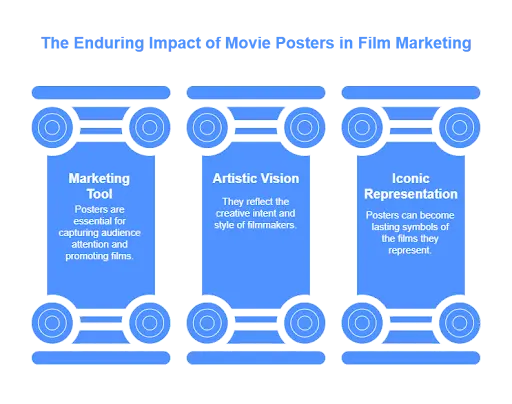
Despite the rise of digital advertising, the classic movie poster remains an essential marketing tool. Still depending on visually appealing thumbnails, streaming companies like Netflix and Disney+ draw ideas from classic posters. The ability to capture an entire film’s essence in a single image is a skill that will always be relevant in the film industry.
Even as marketing techniques evolve, posters remain a nostalgic and collectable aspect of cinema. Movie posters reflect the creative and cultural trends of their period, therefore serving as historical markers beyond their intended use in marketing. For designers and cinephiles alike, these posters offer endless inspiration and insight into the art of visual storytelling.
Elements That Make Movie Posters Powerful
Movie posters rely on several key design elements to captivate audiences and effectively sell a film. Below are some of the crucial factors that contribute to their impact:
A First Impression That Lasts
Before a film’s trailer drops or reviews surface, its poster serves as the first introduction to audiences. A film’s tone, genre, and narrative may be immediately communicated with outstanding design. From the “Jaws” poster’s striking simplicity to the wild mosaic of “Everything Everywhere All at Once,” these images speak what words often cannot. With colours, typeface, and images to arouse feelings and pique interest, a well-designed movie poster can spark curiosity.
The Power of Colour Psychology
Colours aren’t just decorative; they shape perception. Deep reds and Blacks are common in horror films and evoke urgency and terror. To capture warmth and lightheartedness, romantic comedies approach pastel pinks and soft pastels. Conversely, science fiction posters represent future ideas using cool tones like blue and metallic hues. These choices aren’t random; they use visual communication techniques to create viewer expectations before a trailer opens.
Typography: More Than Just Words
A movie’s title font can tell you a lot about its content. While hand-written, cursive styles point to intimate or emotional narratives, blocky, capitalised fonts convey explosive energy. Think about how “Stranger Things” quickly envelops viewers in an ’80s horror aesthetic using vintage typography evocative of Stephen King books. Every element of text arrangement and design is meticulously selected to guarantee the message complements the branding of the movie.
Iconic Imagery: Less is More
Some of the most memorable posters rely on minimalism. One single, well-placed picture may be more than a cramped design. Consider the “E.T.” ad, where the brilliant fingertip touch denotes connection and awe, or the “The Dark Knight,” with a fiery bat emblem lighting a gloomy metropolis. These pictures are still legendary as they instantly capture the narrative’s core. Simple but arresting images have the power to remain in the audience’s memory long after the movie opens.
Trends Shape Movie Posters
Over the decades, movie poster design has evolved with changing trends. Digital creativity replaced the golden era of hand-painted posters to produce hyper-realistic compositions. Inspired by conventional screen printing, recent trends have returned to classic looks. Minimalist posters, which strip designs down to their essentials, have also gained popularity. These shifts reflect broader changes in design preferences and consumer behaviour, proving that visual communication continues to adapt to modern tastes.
The Rise of Digital and Motion Posters
Movie posters are no longer stationary in the digital era. Motion or animated posters now bring aspects of a movie to life, therefore creating a dynamic viewing environment. Studios send out pictures on social media that move in small ways, like light signs flashing or shadows moving, to get people more involved in new and engaging ways. These new ideas make visual communication more engaging, giving moviegoers more ways to connect with films than just reading about them.
Cultural Impact and Symbolism
Movie posters often transcend marketing and become cultural symbols. Many goods have been made replicas of the famous Pulp Fiction poster, which shows Uma Thurman with a cigarette and pulp magazine. Similarly, the puppet hand emblem of The Godfather has come to represent power and control. A brilliant poster becomes part of popular cultural history, not alone sells tickets. This is a testament to the power of strong visual communication and its lasting impact.
Conclusion
Movie posters are not just promotional tools. They are a masterclass in visual storytelling. Using colour psychology and striking imagery ensures a film’s message reaches the right audience. If you want to develop your creative and persuasive communication abilities, The Knowledge Academy offers free resources to help you master these essential skills.